

Brand and press
The NCL Travel brand for press and partners: our idea, the logos to download, our colours and type, how we write, and how not to use the logo.
Our idea: the peak
In our wordmark the A of TRAVEL loses its crossbar and rises to a point: the moment a trip lifts off. Everything around it stays calm and exact, like a departures board.
What we stand for
Clear
Prices, rules and times in plain words. You know what you pay, what is included and when you travel.
Ready
Live fares, a London team to talk to, and ATOL protection on our holidays.
On your way
Home to Bangladesh, Umrah, the Gulf and the world, from airports across the UK.
Logos
The wordmark
NCL TRAVEL in Barlow Condensed Bold capitals, with our own A in orange. Use the files as they are. Keep clear space of half the cap height on every side, and never set it smaller than 110 pixels wide on screen or 30 mm in print.

Full colour
Download Full colour, SVG, 3.6 kB

One colour ink
Download One colour ink, SVG, 3.6 kB
One colour white
Download One colour white, SVG, 3.6 kB
The mark
Download The mark, SVG, 0.5 kB
Full colour for email and documents
Download Full colour for email and documents, PNG, 10.7 kB
Reverse for email and documents
Download Reverse for email and documents, PNG, 8.7 kB
The mark for profile pictures
Download The mark for profile pictures, PNG, 7.3 kB
Using the wordmark
Do and do not
The wordmark works because it never changes. Please keep to these.
Do Use the full colour logo on Paper or white. Do Use the reverse logo on Ink: white letters, the orange A. 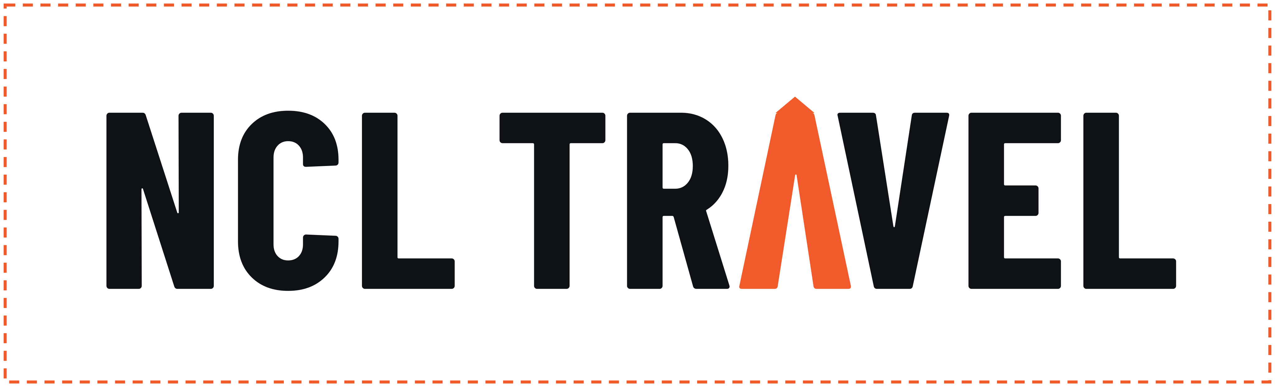
Do Keep clear space of half the cap height on every side. - 110 px or 30 mm
Do Keep it at least 110 pixels wide on screen and 30 mm in print. 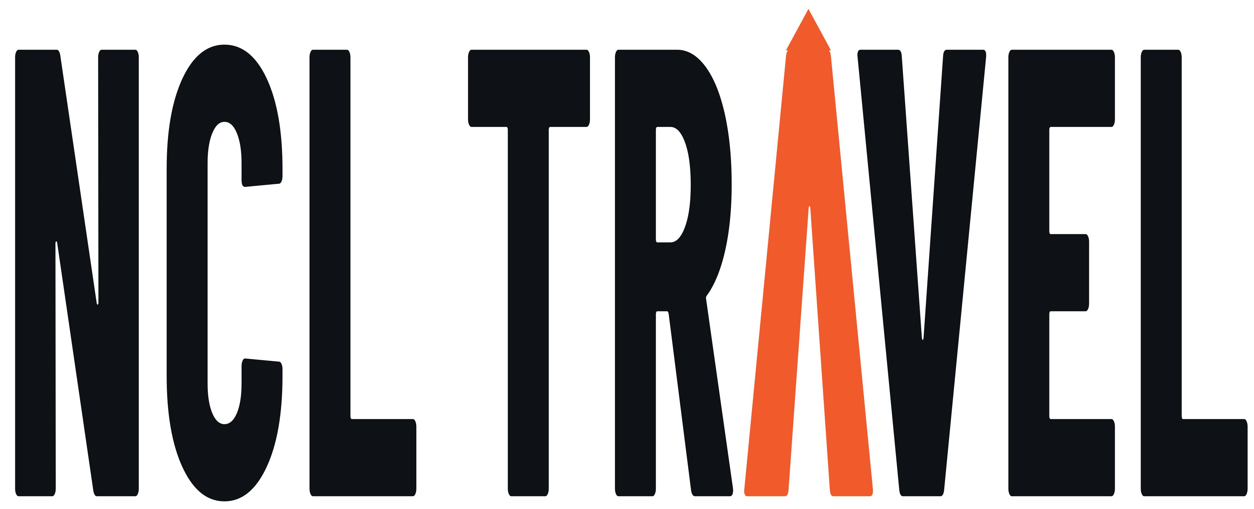
Do not Stretch or squash it. 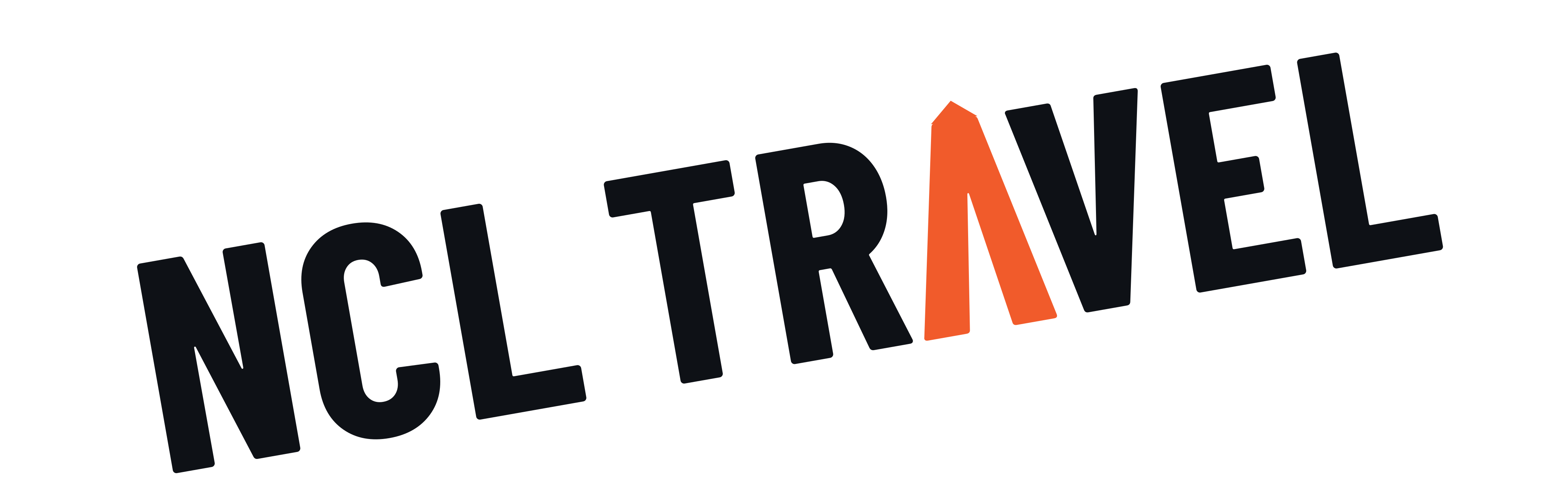
Do not Turn it. 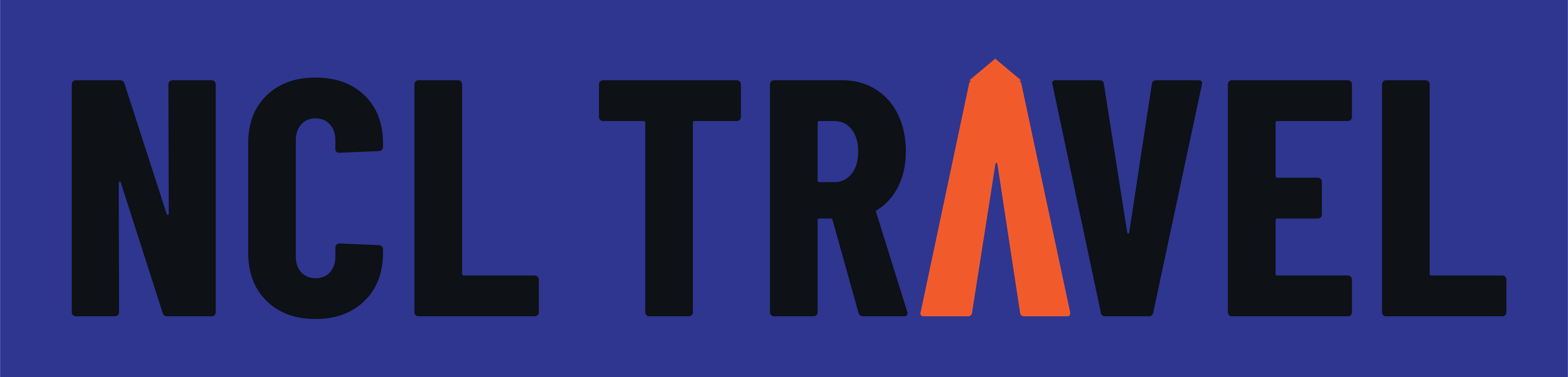
Do not Set it on a weak or busy ground. 
Do not Type the name in a font. 
Do not Put the crossbar back on the A. 
Do not Recolour the A. 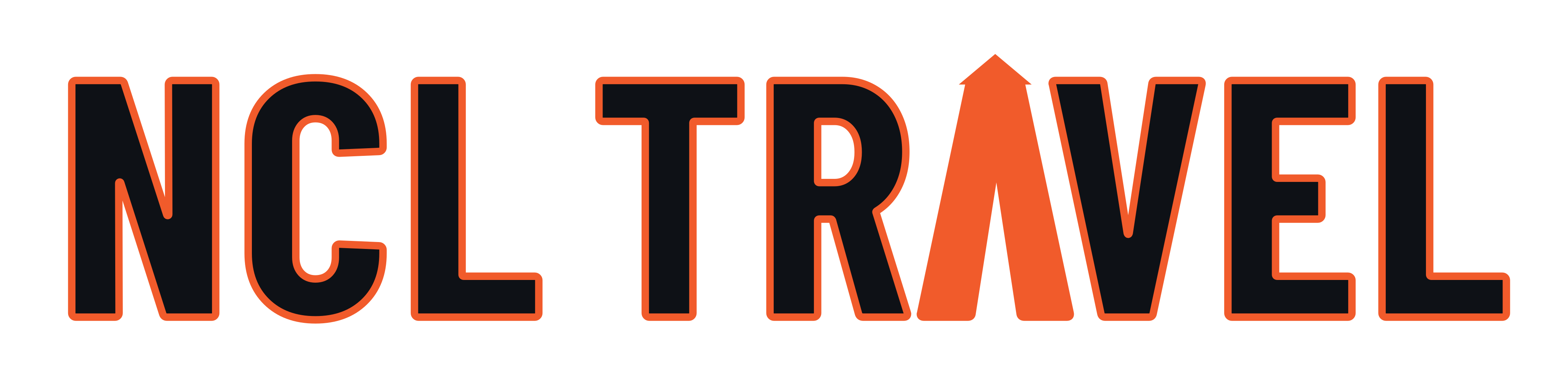
Do not Add symbols, shadows or outlines. 
Do not Set it as one word.
Colour
Colours and their jobs
Roughly 58 parts Paper and white, 24 Ink and Board, 11 Indigo, 5 Orange and 2 Signal. Each colour has one job.
Ink
#0E1116
Text, the wordmark and dark bands
18:1 on Paper
Paper
#FBF9F4
The ground
Ink on Paper reads at 18:1
Orange
#F15B2B
The A, the current page and one accent
3.3:1 on white: large type and graphics only
Orange text
#BC4722
Orange words on light grounds
5.2:1 on white
Indigo
#2E3690
Buttons and links
White on Indigo reads at 10:1
Indigo on dark
#7A7FB8
Buttons and links on dark grounds
5:1 on Ink
Signal
#FFC72C
Highlights on dark grounds only
12:1 on Ink, never words on white
Board
#161A21
Departures boards and dark panels
White on Board reads at 17:1
Board rule
#3A414C
Thin rules on the board
For lines, never words
Type
Three typefaces
All three are free to use under the SIL Open Font License.
Headings
Barlow Condensed Bold
London to Dhaka, every day
Headings and the wordmark, always in capitals
Running text
Open Sans
Prices, rules and times in plain words.
Running text, forms and buttons
Codes, times and labels
IBM Plex Mono
LHR 21:40 DAC
Airport codes, times, references and labels
Graphic language
Departures boards, ticket cards and dotted orange routes. Line illustrations in a single weight with one orange detail. Square corners, thin rules and an 8 pixel grid.
Never gradients, rounded pills, drop shadows or emoji.
How we write
Plain, exact, warm and honest, in British English. We say what things cost, what is included and what happens next, in short sentences.
Press and partners
For interviews, pictures or anything else for a story, talk to our London team.